How Thumbnails Affect Click-Through Rate — And What You Can Learn From the Best Ones
Before anyone watches your video, they make a decision about it. That decision happens in less than a second, and it is based almost entirely on two things: the title and the thumbnail. Everything else — the quality of your content, the editing, the audio — none of it matters if someone scrolls past without clicking.
What Click-Through Rate Actually Means
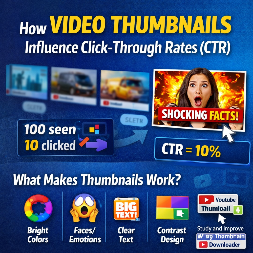
CTR is simple in theory. If a hundred people see your video in their feed or search results, and ten of them click on it, your CTR is 10%. A higher number means your thumbnail and title combination is doing its job. A lower number means something is getting in the way — either the topic is not relevant to the audience seeing it, or the visual presentation is not compelling enough to make them want to find out more.
Why Visuals Work Faster Than Words
Our brains process images significantly faster than text. When someone is scrolling through a YouTube homepage or search results page, they are not reading — they are scanning visually, and something either grabs their attention or it does not.
A well-designed thumbnail does a few things at once:
- Communicates the topic at a glance — the viewer should not need to read the title to understand what the video is broadly about
- Creates curiosity — a question in the viewer's mind that the video promises to answer
- Signals channel quality — particularly important for viewers who have not seen your content before
- Builds brand recognition — consistency across videos means regular viewers recognise the channel before they have read the name
Bright, high-contrast colours make a thumbnail stand out against the surrounding interface. Emotional expressions — particularly on faces — draw the eye in a way that objects and text alone usually do not. Clear, readable text adds to the image rather than just labelling it. These are not arbitrary rules — they are patterns that show up repeatedly when you study thumbnails from channels with strong performance.
Why Studying Other Thumbnails Is Worth Your Time
You can read about thumbnail design principles indefinitely, but there is a limit to how much theory helps without seeing it applied in practice. The most direct way to improve is to look at what is actually working — in your specific niche, on the specific topics you cover — and understand why it works.
When you build a reference library, look for patterns across these questions:
- What colours are coming up repeatedly?
- How much text is being used, and where is it positioned?
- Are creators showing faces, or leading with a visual concept?
- What is the relationship between the thumbnail and the title — are they saying the same thing, or doing different jobs?
The Mistakes That Kill CTR
Most thumbnail problems fall into a small number of categories. They come up so consistently it is worth naming them directly.
- Too much going on — The viewer has half a second. Three text elements, a busy background, multiple focal points, and competing colours means the eye does not know where to land. Nothing registers, and the scroll continues. Simplicity is a practical requirement, not a design preference.
- Low contrast — A thumbnail that blends into the YouTube interface, or uses colours too similar to the thumbnails beside it, loses the visual competition before anyone consciously registers it. Contrast — between subject and background, between text and image — is what makes a thumbnail visible.
- Misleading visuals — A misleading thumbnail might generate a click in the short term. In the long term, it generates a quick exit, low watch time, and a viewer who has learned not to trust the channel. YouTube's algorithm notices all of this.
- Text too small to read at thumbnail size — Thumbnails are displayed at many sizes across different devices. Text that looks fine at full size can become completely illegible as a small search result on mobile. If the text is not readable when the thumbnail is small, it is not doing any work.
- Inconsistency across videos — A channel where every thumbnail looks completely different is harder for viewers to develop a relationship with. Visual consistency — a recognisable style, a consistent colour palette, a recurring layout approach — builds brand identity.
How Different People Use This Research
- Creators improving their own thumbnails — A reference folder of thumbnails from high-performing channels in your niche is a practical resource you return to every time you design a new one.
- Marketing agencies and content strategists — Concrete visual comparisons — here is what competitors are doing, here is what your thumbnails look like, here is the gap — are far more convincing to clients than describing the same thing in words.
- Graphic designers on YouTube projects — Understanding the visual conventions of a niche before starting work. Downloading thumbnails from relevant channels and studying the design approaches is a standard part of the briefing process.
- Educators and researchers — Real examples for teaching materials, presentations, or academic work on digital media, content strategy, or visual communication.
What Actually Makes a High-CTR Thumbnail
Based on what consistently shows up in channels with strong click-through rates, a few principles are worth internalising:
- Keep the text short. Under five words is a reasonable target. The thumbnail is not the place to explain the video — it is the place to make someone want to watch it. A word or two that creates intrigue does more work than a full sentence that summarises the topic.
- Use a face if you can, and make the expression count. A genuine, clear emotional expression — surprise, excitement, concern, delight — draws the eye and creates an immediate human connection. The viewer can tell the difference between a real expression and a stock-photo one.
- Commit to one main message. What is the single thing you want someone to understand from the thumbnail? One clear focal point, one clear idea, one reason to click. If you cannot answer that clearly, the design will reflect that uncertainty.
- Test and track. YouTube Studio gives you CTR data at the video level. Over time, patterns in your own data are more valuable than any general advice. Try things and look at what happens.
The Practical Side
If you are doing this research regularly — studying thumbnails, building a reference library, analysing what works in your niche — having a reliable way to download thumbnails in full resolution makes the whole process faster and cleaner.
Over time, the reference library you build becomes one of your most useful design resources. Every thumbnail you study, every pattern you notice, every principle you test on your own channel compounds into a practical understanding that no amount of reading can replicate.
Download Any YouTube Thumbnail in Full Resolution
Free · No account required · Multiple resolution options · Any video, instantly
YouTube Thumbnail Downloader →